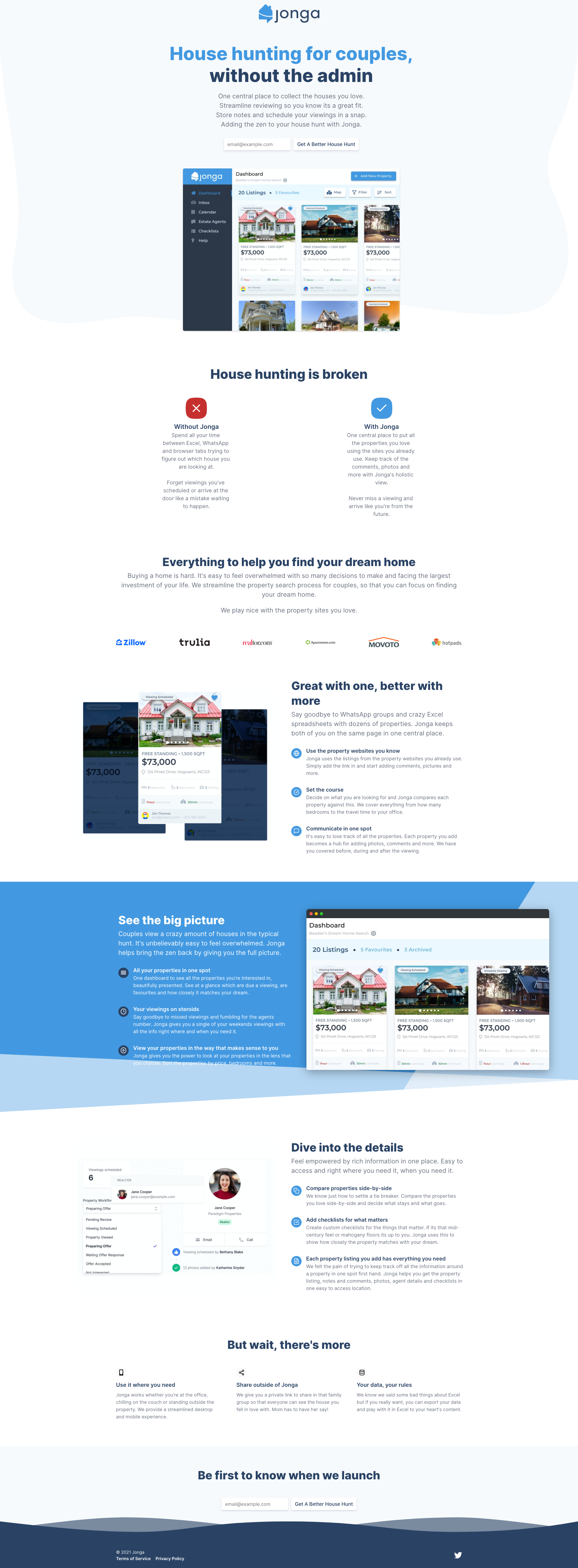
Complete redesign of the Jonga landing page after all the feedback
I went back to the drawing board with Jonga and rebuilt the landing page from scratch. I changed platforms too so that I could accelerate iterations on the design instead of battling with code to get it to look right.
Its still a work in progress but I wanted to get some feedback ASAP. You can view the live site https://www.jongaproperty.com/
The new design:

The old design:

New design looks 10x better!!
Curious - what platform did you switch from and what are you using now?
@poppacalypse @sergio Originally I had done it as a Gatsby site that I was deploying to Firebase. I'd bought a template on Themeforest but it ended up being a lot of effort doing dev work instead of just iterating on improving the landing page and iterating on the message. This lead to me having some resistance to making improvements knowing the impact of the effort required.
I ended up looking for different landing page generators that would'nt require me to have buy a template to look decent, iterate rapidly, supported blogging, provided just-enough integrations and wasn't prohibitively expensive. Being based in South Africa where the Rand/Dollar exchange rate is'nt great leads to having to think about the impact of the costs. They all add up.
Umso, previously known as Landen, was what I ended up using https://www.umso.com/
I'm really happy with the tool. I've spent most of my time polishing and improving the messaging.
Here's my feedback as promised on Telegram
What's the admin part of your H1 referring to? When I did house hunting I just kept a google spreadsheet with 3-4 columns, URL, my notes, her notes and next steps.
I love the WITH and WITHOUT part of the website, it really clearly shows what people do TODAY versus what they're missing out on. Usually people do these blocks and say - STOP DOING THIS…DO THIS INSTEAD. but that is beside my point. Any idea if you can add an image here to show how people do it like me (Excel, or some note taking app) vs how they would do it using your polished UI/Platform?
I think moving the logos (for trust factor) higher up would be beneficial, put them just after your header sectio/hero - in the above the fold section precisely.
I feel like there is a little too much text in the feature section, can you compress the text by half by removing unecessary words and repetition?
You Pre-Footer CTA could be better "Get a Better House Hunt" - doesn't really tell me what to expect from clicking that field "Notify me" or "Notify me when it's ready" - it's obvious already that you're aiming at house hunters by all the rest of the copy at this point.
Footer…no bueno - too few info - lack of trust immediately. Check this out -> https://www.youtube.com/watch?v=7PYSUMfwSH4
@orliesaurus Thanks! I've made a few changes to try and improve things. Please have a look if you have a gap.
Please sign in to leave a comment.